
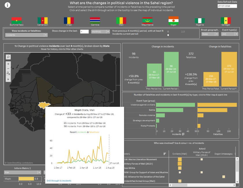
In August, the UN Development Programme issued a request via the Viz for Social Good initiative for inspiration on how to visualise incidents of political violence, overlaid with risk factors about the region they are occurring in.
My response shows how Tableau might be used by an analyst to
a) identify areas of increasing violence, at a granular geographical level, based on comparing one time period to the previous period
b) select and view various INFORM risk scores about that region
c) drill through to an incident-level dashboard showing the timeline of events and all of the details about the events themselves

I combined the incident data with ISO region data for each country using Alteryx, which contains a tool for spatially joining data based on the coordinates of an event being contained in the boundaries of a certain administrative region. I then blended the Inform metrics (measures of a region’s vulnerability) in Tableau.
