Featured

Analytics made easier: my top use cases for the new ROW_NUMBER(), RANK(), and LOD calcs in Tableau Prep

As of version 2020.1.3, Tableau Prep now has the capability to create analytic calculations and {FIXED} LOD calcs – something many I’ve been hoping for ever since I first saw Prep back in 2018! They help us to answer questions that previously needed table calcs, hiding rows, and tricks in Tableau Desktop, or just simply weren’t possible and needed some data prep pre-Tableau.

A caveat that comes with building these fields using these calcs in Tableau Prep is that they’re not dynamic – they won’t respond to filters, for example – so you may find yourself coming back to Prep to create a new fields for each specific question. Nevertheless, these calcs make tackling the cases below much easier than before.

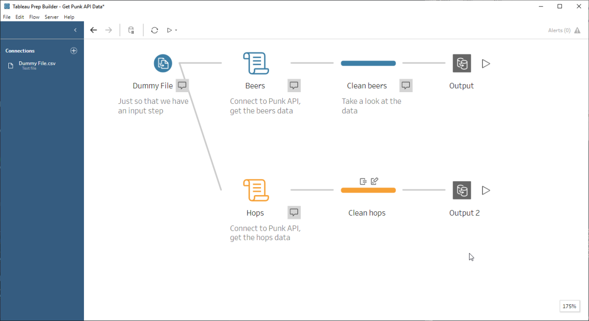
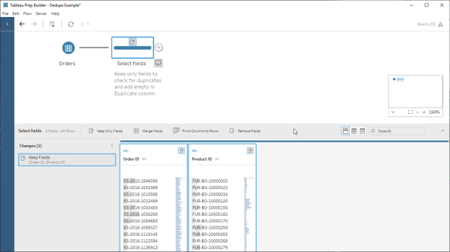
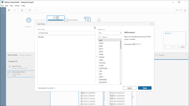
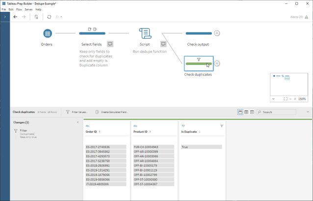
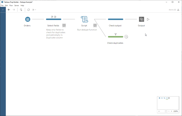
Being in Coronavirus lockdown has given me time to write up my favourite uses (not in order of importance) for these new calcs; this Prep flow has a worked example for each use case.

1. Adding a simple row identifier to your data:

More often that any of us would like, we come across (or get given) datasets that have no unique identifier, or each row’s uniqueness is a combination of different columns (and we’re left to work out which ones they are for ourselves). Worst of all is where there’s nothing to identify that each row is a distinct ‘thing’, save for the fact that it’s a different row!

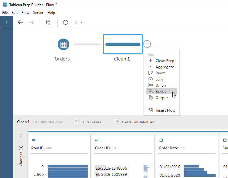
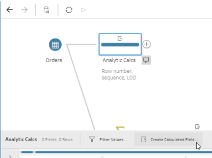
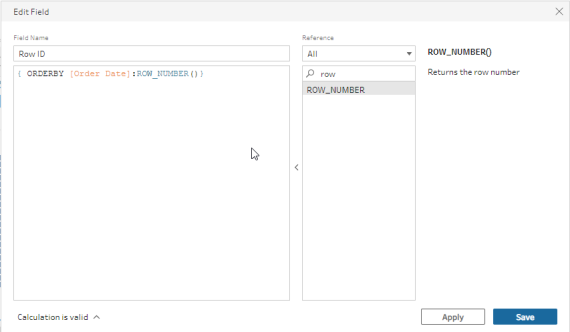
To create a row id, click the Create Calculated Field… icon and use the calculation:

calcbutton

{ ORDERBY [Some Field]: ROW_NUMBER()}

Note: There’s a catch to be aware of with the ROW_NUMBER() function, in that you have to order by a field (it’s not possible to retain the incoming row order). What this means is that as it stands, it’s not possible to create a calc that records the original sort order (yet).

rownum

Now we can use our Row ID as a dimension in Tableau and display individual rows where we need to.

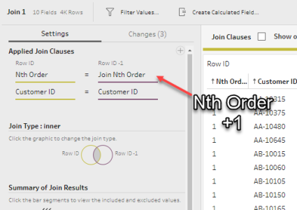
2. What did the customer buy in their 3rd order?

Ordering sequential events:

I worked with a customer running a subscription business who wanted to know all about customers’ third order, since their first two came under an introductory offer. Answering questions about a customer’s nth order can be fiddly to answer using Desktop/Web Edit alone and involve table calculations to get the nth, hiding rows, and difficulties doing deeper analysis on those orders. The RANK() function can make this simpler by ranking a customer’s orders by date (or any other field for that matter). If we write our calculation

{ PARTITION [Customer ID]: { ORDERBY [Order Date]: RANK()}}

then we get an incrementing number for each order date – telling us the nth order for each customer:

nth order

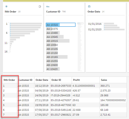
Now if we want to analyse how each customer’s third order (if they had one) we no longer need table calcs, we can just filter on our Nth order column.

3. What’s the average interval between a customer’s orders? Can we analyse those ‘high frequency’ customers?

Making comparisons across rows:

Segmenting your customers by the frequency at which they normally ‘do stuff’ (like placing a new order) means that you can track and treat them differently, and possibly intervene when they haven’t ordered for a while. Whilst calculating the time difference between orders is easy with a table calc, it’s tricky is to go further and analyse those ‘frequent orderers’ since table calcs require you to have all data in your view.  

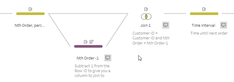
To calculate the time difference between orders, we need to look at the row below each one and compare the dates – effectively a lookup function. This capability isn’t immediately apparent since there isn’t a lookup function in Prep as such; however (and this is sometimes how I do it in SQL anyway) we can take our Nth Order field above and then join the data to itself like so (written in SQL style, nowhere in Prep will you have to type anything like this):

[Customer ID] = [Customer ID] AND [Nth Order] = [Nth Order]-1

Order 1 from the left side will be paired with Order 2 from the right for each customer,  so now the columns from your right-hand side represent the next order in sequence. The linked Prep flow will illustrate this better than I can articulate it!

Self Join

Join

Once we have the time interval, we can easily group our customers into buckets and begin our analysis. More on this below…

4. Pre-computing LOD calcs for performance (at the expense of flexibility)

Now that we’ve got our time interval, can we group our customers into buckets based on their average order frequency? What we want is the average order interval at a customer level.

LOD calcs in Desktop / Web Edit are perfect for this, but with lots of them on lots of data, you can start running into performance issues. You might choose to pre-compute your calculations in Tableau Desktop to alleviate this – however, since LOD calcs are dynamic based on your view, they can’t be pre-computed. The new LOD calc offers a way of pre-computing this into your data source and saving the performance hit of LODs.

computenow

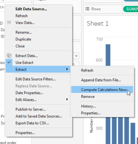
This has actually already been possible in Prep using a combination of an aggregation followed by a self-join, but was a time-consuming workaround and ran into problems if you didn’t have a nice unique id for the thing you were aggregating. 

Warning – given the caveat about dynamic-ness (dynamism? dynamicity?) above, I would only recommend this in cases where performance is a significant issue and you have already decided what views you need, since your LOD calc will no longer take into account any filters. As such I’d only recommend this part of a performance fix on a finalised and relatively fixed dashboard view!

LOD calculation syntax is exactly the same in Prep as in Desktop/Web Edit:

{ FIXED [Customer ID]:AVG([Time until next order])}

Now that we have this, it’s easy to bucket up our customers in Tableau with some calculations and save re-computing the LOD.

5. What percentile does each order sit in? Can I filter out outliers? Calculating percentiles:

Just as in Desktop/Web Edit, the RANK_PERCENTILE() calc calculates what percentile each row is based on a measure, within a certain set of rows – for example, which orders are the top 5% in terms of total profit made in a given year?

Like the examples above, this is something that can be done with a table calc but it’s difficult to analyse further. Happily, Prep makes this easier and the syntax is just like our RANK() above:

 { PARTITION [Order Year]: { ORDERBY [Profit]: RANK_PERCENTILE()}}

Note that you can’t do calculations inline – and if you try you’ll get this error message:error

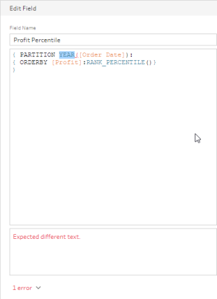
Now we have the percentile that is fixed in our data, so it’s easy to filter and aggregate without disrupting the percentile calculation.

For the moment, these are the top use cases that have come to my mind but I’m sure there are more out there – please let me know of any in the comments below or tweet me @honytoad !

Featured

A step-by-step guide to integrating Python with Tableau Prep

With the release of the Script step in Tableau Prep 2019.3, it’s possible to integrate Python with Tableau Prep to fetch data from web APIs, use Google’s Geocoding API to fetch postcodes, or deploy predictive models on your data, to give just a few examples. Tableau can already integrate with Python as a table calc on aggregated data, but Prep integration allows us to run Python functions at row level which is more suitable for use cases like sentiment analysis, where it’s most helpful to score text row-by-row before aggregating in a viz. Here’s a step-by-step guide!

All the files for this blog post can be downloaded from here.

Getting started

The rest of this post assumes that you have already installed python on your machine. If you haven’t, the Python downloads page here but beware that choosing which version(s) to install can be frankly confusing (not to mention whether to use the Anaconda distribution or not). This post offers a decent summary of where to start and the differences between Python 2.7 and 3.x (even for mac users, although macs come with Python 2.7 installed), as does this article from Real Python.

The Script step in Prep allows you to connect to a Python or R service running on a machine (either the same computer that’s running Prep or a separate server) and pass the data in Prep to it as a dataframe; for R this would be a native dataframe and for Python this means a pandas dataframe.

Integrating Tableau with Python requires TabPy, a framework that allows Tableau to execute Python code and pass data to it.

Update, 25th March 2020: As of Tableau 2020.1, TabPy is now fully supported by Tableau and has an easier installation process, as well as some pre-built statistical functions for easy use in Tableau (or anywhere else!) and other enhancements.

  1. Install TabPy using pip – simply a case of typing pip install tabpy in your command line
  2. Develop your script(s); I personally use Spyder (which comes with Anaconda) but there are loads of alternatives including PyCharm, Jupyter, and SublimeText
  3. Start TabPy. How exactly you do this depends on your installation, I do this through Anaconda Prompt using the tabpy command. By default TabPy runs on port 9004; here’s how the console looks when it’s running:1 console
  4. Insert one or many Script steps into your flow, point them at your pre-written script file, and tell them which function to use.Insert script3 connect
  5. Run the flow. You can run it manually, use Prep Conductor in Tableau Server with the data management add-on, or from the command line; as of now Tableau Online doesn’t support external service connections.

The script

So what does your python script need to contain?

  1. One or more functions to be executed by Prep that accept a dataframe as their only input and return a result, which Prep will take as the script step’s output. Note that in some cases you might be using a script purely to fetch external data as an input to Prep, in which case you can simply send it a dummy value.
  2. As an optional requirement, if the number or data type of columns in your function’s output is different to the input from Prep, then you will need to create a function called get_output_schema to tell Prep what schema to expect from the script. More on this below.

Note that the first thing that Prep does is run the entire script. This means that any importing of modules and supporting functions will be run, but this also means that any code that you might have used for testing will get run too, so comment out/remove any non-essential code. Be careful if your comments contain any file paths with escape characters in, even if commented out they can sometimes throw an error (at least in version 2019.3.1).

Worked example #1 – detecting duplicates across a set of columns

In this example we want to see if there are any duplicate rows in our EU Superstore. Python’s pandas library has a really good function for doing this called duplicated. As a product consultant I often get customer datasets without much explanation to them, so checking for duplicates (in)validates my assumptions about the uniqueness of each row.

Step 1: Create the function we are going to call from Prep

The dedupe function itself is pretty simple, just adding a column to the dataframe as the result of the duplicated function:

import pandas

def simple_dupe_detect(df):
    print('\nChecking if input data contains any duplicates across all columns...')
df['Is Duplicate'] = df.duplicated(keep=False)

    print('Number of rows: ',len(df))
    print(len(df[df['Is Duplicate'] == True]),'duplicates found')
    return(df)

There are a few things to note:

  1. The function itself can only take one argument, the dataframe from Prep.
  2. Printing things to the console means you can look at your open TabPy console window and check what’s happening to help you debug (I never get my scripts right first time!).
  3. Prep seems to run the script quite frequently as you navigate around the Prep tools for it to refresh the data – watch out for hitting any API or data limits as the number of rows queried can add up.
  4. Any changes (filters, calculated fields) you make in the script step will happen on the script output, not the input!

Step 2. Define your output schema (optional)

Now we need to create a function called get_output_schema.

The get_output_schema() function needs to return a pandas dataframe with the columns, each with its defined Prep datatype. There are 6 Prep datatypes:

Function in Python Resulting data type
prep_string () String
prep_decimal () Decimal
prep_int () Integer
prep_bool () Boolean
prep_date () Date
prep_datetime () DateTime

Here’s an example:

def get_output_schema():
    return pandas.DataFrame({
            'Order ID' : prep_string(),
            'Product ID' : prep_string(),
            'Order Date' : prep_date(),
            'Quantity' : prep_int(),
            'Sales' : prep_decimal(),
            'Is Duplicate': prep_bool()
            })

An important consequence of having to predefine the output schema means that you can only have one output schema per script. This makes it more complex to write a generic script that can be inserted into any workflow. For our deduping example this means I have to decide which columns I want to check for duplicates in advance, then tailor the script to those columns.

Ideally we would find a way for our script to examine the output from our chosen function and dynamically generate the output schema. However, get_output_schema() seems to be the very first thing in the script that Prep runs (i.e. before your chosen function can produce any output) so I haven’t yet worked out a way to do this, if it’s at all possible.

However – there is a simple if somewhat cheeky workaround – simply add a column called ‘Is Duplicate’ in Prep, assign it a dummy value with the correct datatype, and pass that into the script. Now my data out of the script will always have the same schema as the data going in – which means I don’t need to write get_output_schema and I have a generic deduping script that I can use in any flow at any point. Easy!

  1. Keep only the fields we want to check for duplicates:4 keep
  2. Create our Is Duplicate column with a dummy value, here I just put FALSE to make sure it’s a boolean:5 dummy
  3. Insert and configure our script step:6 script
  4. Taking a look at our duplicated records, it turns out that there can be more than one row for the same product in the same EU Superstore order – who knew?7 check

And now we have the end-to-end flow:7 e2e

Worked example #2 – Fetch data from a REST API and bring it into Prep

The script step also allows us to bring in data from outside of Prep, for example from an API, or semi-structured data source like XML that needs some flattening. You can’t use it as an input step (i.e. it always needs an input itself) but you can circumvent this by simply having a dummy file as input. In this super simplified example we are going to fetch data from the Punk API (thanks very much to @samjbmason) to get information about Brewdog’s beers.

This time our script will fetch the beers JSON data, flatten it, and pass it to Prep. I’d like to break out hops from the beers data as a separate table so I’ll need a different get_output_schema function – and therefore a different script – to do this. Again, the code itself is simple:

import requests as req
import pandas as pd

# function to fetch data directly from the punk API
def get_punk_from_api(df):
    payload = req.get('https://api.punkapi.com/v2/beers?per_page=80', verify = False)
    data = pd.io.json.json_normalize(payload.json(), max_level=0)
    print('\nPayload sample:',data.head(5),sep='\n')
    print('\n',data.dtypes)
    data = data[['id','name','tagline','first_brewed','description','image_url','abv','ibu','target_fg',
             'target_og','ebc','srm','ph','attenuation_level','volume']]
    return data

# this defines the columns and data types going back out to Prep
def get_output_schema():
    return pd.DataFrame({
        'id' : prep_decimal(),
        'name' : prep_string(),
        'tagline' : prep_string(),
        'first_brewed' : prep_string(),
        'description' : prep_string(),
        'image_url' : prep_string(),
        'abv' : prep_decimal(),
        'ibu' : prep_decimal(),
        'target_fg' : prep_decimal(),
        'target_og' : prep_decimal(),
        'ebc' : prep_decimal(),
        'srm' : prep_decimal(),
        'ph' : prep_decimal(),
        'attenuation_level' : prep_decimal()
        })

In goes the dummy file (one column with one row) and the script step:8 punk

The end-to-end flow:9 punk e2e

What next?

These have been very simple examples, and one thing that’s missing is any kind of parameterisation. In our deduping example we have to keep only the columns that we want to flag as duplicated; if we wanted our Is Duplicate column against our full dataset we’d have to aggregate down to one record per Order Id and Product Id, then join back to the original table. Ideally we’d like to be able to tell our simple_dupe_detect function which columns to check across without having to hard code it in – and I’ll cover my solution for this in a follow-up blog post.

Download the files for this post here.

Use Tableau to display PDF documents

How to view PDF files in Tableau

This ask came to me from a customer who has lots of PDF reports produced across their company and they wanted a way of making them accessible to users in a single place, alongside their Tableau dashboards. So is there a way to do this?

Happily, PDF files can be viewed in web browsers, and Tableau handily includes the Web Page dashboard object that we can use to do this. Take a look at my example and/or read through below to see how it’s put together.

Tableau dashboard to view pdf files

Making the files accessible

Your PDFs need to be in a location that’s accessible using a URI. It’s not possible to view local files in the Web Page object so it needs to be a web-accessible location, and with a majority of companies using cloud file-sharing solutions like OneDrive, Dropbox, and Google Drive, we have a way that plenty of users will be able to implement.

Step-by-step walkthrough

Here I run through an example using Microsoft OneDrive and, ironically enough, some PDFs I’ve created from some Tableau dashboards:

  1. Store your PDF documents in a web-accessible location (i.e your cloud storage solution with sufficient permissions to allow the document to be viewed publicly)
  2. Find the URI (i.e. link) to your document – preferably a link intended for embedding the document into a web page. Using an embed view of the document means users don’t see a toolbar that allows them to navigate and start wandering through OneDrive instead of viewing the document:
OneDrive embed link

OneDrive has an Embed button that gives you this HTML to paste into a web page. You need the URI, not the surrounding HTML

3. Create a spreadsheet with a row for each document and its URI that you can use as a data source, something like this:

Excel file with URI for each document

4. Connect to your spreadsheet and start building out a dashboard. I opted for a simple viewer dashboard with a navigation sheet and a URL action that allows a user to click on the name of the document, passing the URL to the Web Page object:

5. Voilà! At this point you should have a working PDF viewer dashboard, and if not let me know in the comments below so I can help debug.

You can see and download my example here.

How Tableau can assist crisis relief efforts: visualising political violence

Political Violence Sahel DB

In August, the UN Development Programme issued a request via the Viz for Social Good initiative for inspiration on how to visualise incidents of political violence, overlaid with risk factors about the region they are occurring in.

My response shows how Tableau might be used by an analyst to

a) identify areas of increasing violence, at a granular geographical level, based on comparing one time period to the previous period

b) select and view various INFORM risk scores about that region

c) drill through to an incident-level dashboard showing the timeline of events and all of the details about the events themselves

Political Violence Sahel DB - Incident

I combined the incident data with ISO region data for each country using Alteryx, which contains a tool for spatially joining data based on the coordinates of an event being contained in the boundaries of a certain administrative region. I then blended the Inform metrics (measures of a region’s vulnerability) in Tableau.

How has the popularity of Game Of Thrones characters’ first names changed since its release?

A Tableau visualisation exploring the popularity of game of thrones character names in US baby names

Screen Shot 2017-10-03 at 22.59.13.png

This dashboard was inspired by the growth in popularity of the name Arya (after orphaned noble-turned-assassin Arya Stark) in US baby names, and is meant to be a light-hearted look at name trends over the last 20 years.

A couple of interesting nuggets:

  • In 2016, 57 babies were named Daenerys
  • Common names are getting less common – Jaime, Robert and Jon all show significant negative growth

The US baby names dataset is taken from social security applications and is available as one of the sample datasets in Google BigQuery, whilst I scraped the Game of Thrones character names from this handy wikipedia page.

Notes:

  • I’ve included homophones (e.g. Jaime, Jamie) within each ‘Game of Thrones name’
  • The percentage growth calculation calculates the change in births from either 1996, or from the first year post-1996 (since it’s impossible to calculate % growth from 0)

#DebateNight sees Hillary back on top of Twitter

Hillary Clinton’s fortunes on Twitter have undergone something of a turnaround in the week following her first head-to-head debate with Donald Trump. Whereas tweets from Hillary’s account were previously lagging behind Donald’s in terms of retweets and favourites that each one generated, her posts now occupy the top spots, largely thanks to the popularity of her tweets about #DebateNight.

Click on this image to interact with the dashboard:

click to interact

Hillary’s campaign team have hugely capitalised on her performance in the first one-on-one debate with Trump of the campaign, making #DebateNight the hashtag netting her the most retweets and favourites by a huge margin – the first time she has really been able to gain traction against Trump’s powerful #MAGA in recent months.

hashtags_impact

Can Hillary’s team keep up the momentum? At first sight, it looks as though Clinton and Trump are neck-and-neck when it comes to how many retweets and favourites they generate. However, looking at the total volume of retweets and favourites hides the fact that, on average, Trump’s tweets continue to land with more impact. Let’s see whether this will change into the second debate on the 4th October.

impact_time
Clinton’s debate night tweets find their mark…

avg_impact_time
…but Trump’s still outdo hers on average

Technically speaking: Why some equals are more equal than others in Alteryx

Alteryx’s equals operator is not case-sensitive (v.10.6) which can prove a pitfall if you’re not aware of it. I came across this quirk when trying to count the number of words in all capitals in a set of tweets. Usually, to determine whether a string is in all caps or lowercase you might try something like this:

 UPPERCASE ([Word]) = [Word]

However, it’ll always return true in Alteryx, no matter the case of the characters:

alteryxequals

THE WORKAROUND
So how can you easily check the case of a string? One way is to use a regular expression and replace characters that match it – the RegexReplace formula in Alteryx. You can then check if the string length is zero, like so:

REGEX_Replace([Word], ‘[A-Z]’, ”) = 0

The regular expression above matches all uppercase characters and removes them; if all the characters in a string are upper case text characters then you’ll end up with a zero-length string.

This gets a bit trickier when your strings contain numbers and punctuation; for those cases you should also replace numbers and special characters in your regular expression. For digits you can use the \d character class, and you can make a custom character class for punctuation marks.

How is Trump making so much more impact on Twitter than Clinton?

click to interact

No matter what you think of Donald Trump’s views, it’s hard to deny that what he says gets talked about.

Suspecting that tweets from Trump’s account get more attention than rival Hillary Clinton’s, I decided to investigate the number of times their posts are retweeted and favourited as a proxy for social media ‘impact’, then do some digging into the reasons for differences.

SO WHO MAKES MORE OF AN IMPACT?
The first thing that jumps out is that (as of early Sept.) Trump’s tweets do indeed hold the top 20 spots for the number of retweets and favourites, and almost all of the top 20 hashtags. Can stylistic differences lend any insight into how he’s achieved this?

STYLISTIC DIFFERENCES
The tone of Trump’s tweets have a markedly higher frequency of all caps and exclamation marks – roughly 2 thirds of his tweets contain at least one ‘!’, compared to Clinton’s 3%. Here’s a typical example…

trump_example

… and it seems to be an effective way of getting retweets and favourites:

tweet_style

CLINTON’S TWEETS ARE GENERALLY IMPERSONAL 
What’s interesting is how few tweets Hillary writes herself –

by_hillary
“Tweets from Hillary signed -H”

Her profile description is open about the fact that her tweets aren’t always written by her – and as it turns out, hardly ever are.

By contrast, there’s no such telltale with Trump’s tweets, so followers could be forgiven for assuming he writes them all himself.

The beauty of platforms like Twitter, Reddit etc. is that they make it possible for Average Jo(e) to have a conversation with the rich and famous – Obama’s Reddit AMA is a great example. By passing up on an opportunity to come across as genuine – a point Trump is only too happy to exploit – Hillary comes across as a detached politician paying lip service to social media.

hillary_example_quote
Nothing says authenticity like quotation marks


TECHNICALLY SPEAKING…
The data is scraped using Alteryx’s Twitter download tool (downloaded separately to Alteryx, as of v.10.6). The data’s then processed using Alteryx and uploaded to Google Sheets, which feeds the Tableau dashboard. Tableau Public then refreshes the data on a daily basis – more about this here.

N.B. The Twitter API used only gives you data for the last 7 days, so tweet-level stats are up to date as of 7 days after they were posted. The ideal solution would be to get access to Twitter’s ‘firehose’ of full tweet data, exclusively available via the Twitter-owned GNIP.

Technically Speaking: Automatically refresh the data in your Tableau Public dashboards

Good news! With the release of Tableau 10, there’s now a way of automatically refreshing the data in your Tableau Public workbooks, which brings the number of ways of updating your data in Tableau Public to two. In this post I’ll cover both methods – the previously existing if somewhat hacky way, and Tableau 10’s new Google Sheets connection.

So here they are: 2 ways to keep data in your Tableau Public dashboards up to date. Let’s start with the sleeker one:

Method 1: Use Google Sheets as your data source

Tableau 10 now comes with a built-in connector to Google Sheets. Sheets is Google’s spreadsheet editor and can be used as a data source for Tableau in much the same way as Excel.

GoogleSheets

What Tableau hasn’t done a whole lot of shouting about is that when you upload a workbook with Google Sheets as a data source to Tableau Public, Tableau will offer to keep the data in your dashboard up to date with your Sheets. This way you can append/modify data and have it flow through automatically into your dashboard. Nice.

How to:

  1. Use Google Sheets as the data source(s) for your Tableau workbook – it works in the same way as using Excel, with the exception that you’ll need to sign in to your Google account.
  2. Create an extract / extracts of your Google Sheets data sources. When you publish to Tableau Public, Tableau will offer to embed your Google credentials and keep your data refreshed for you:

PublishGoogleSheets

How up to date will my data be?

From what I can tell, the data seems to be refreshed every day at 10am UTC.

You also have the option of requesting an update; when I tested this, the data was updated about 10 minutes after I sent my request – quick enough for most TP dashboards.

RequestUpdateGoogleSheets

I’ve been using Alteryx to process my data and upload data directly into Google Sheets to use as my data source for this dashboard, so I can run the workflow every day without having to use the below method any more…

Method 2: The ol’ re-upload

This way’s slightly clunkier, but it’ll do the job when using Google Sheets as a data source isn’t practical or desirable.

  1. Open up your Tableau Public dashboard in Desktop (either download it and open it up, open from the same file as you uploaded, or just save over your existing dashboard in Public)
  2. Refresh your data and/or make updates to your dashboard
  3. Re-upload to Tableau Public

Crucially, the URL of your dashboard won’t change, and your precious view count won’t reset either!